Pacific Outdoor Living
A responsive redesign that showcases the value of a successful design business in Los Angeles.
Client
Pacific Outdoor Living
Team
Samantha Gosling
Role
UX Researcher, UX Designer, UI Designer
Results
58% Increase in leads within months of launching.
100% Increase in page views.
Methods
User interviews, Affinity Mapping, Persona Development, Heuristic Analysis, Site Map, User Flow, Usability testing, Design Studio, Style Guide, Wireframes, Rapid Prototyping, Iterative testing.
Business Challenge
Pacific Outdoor Living is a leading landscape design and build company in Los Angeles, providing outdoor renovation services that range from small projects (driveways or garden plans) to large scale projects (pools, fire features, luxury fountains and patios). Winning awards such as Inc. 5000 for becoming one of the fastest growing companies in the US.
They are personable, trustworthy and will go above and beyond to ensure that their clients needs are met. Their website did not align with these values or the quality of the work that they make.
This resulted in a cluttered interface with no hierarchy and multiple CTA’s competing with each other. Users were finding themselves lost and unsure of where to go, creating a distrustful and confusing experience.
Designing a Solution
My goal was to discover what people, who are looking for landscape design, want to see and what compels them to invest in those services.
After conducting research, I designed a user friendly and digestible interface that communicates the value of the company and their impressive outdoor renovations to their audience.
Applying User Research
My user research involved both quantitative data from surveys and qualitative data from user interviews. From my surveys, some main insights I discovered were; the age group of their users, the amount of money they are willing to invest and the types of services they are interested in.
During my interviews, I wanted to understand what motivates users to invest in these services and the things they need to see in order to make a decision.
Key Findings
Users want to have a personal connection with the company and to feel taken care of.
They have had bad experiences in the past with contractors who did not fulfill their promises to them, therefore they are distrustful.
They want to know that the company will go the extra mile and they want to see quality in every element of the process, including the website.
It is important that they see imagery of finished work as well as examples of the process.
User Quotes
“My biggest fear is getting ripped off”
“Their facility is representative of their quality of work”
“I want to see as many photos as I can”
“Let the pictures speak for themselves”
“I want to know about their wealth of knowledge”
“I want people to go the extra mile”
“I want to make sure they are authentic”
Identifying the User
Heuristic Analysis of the Former Website
Problem Statement
There are a lot of people like John who would like to create their dream outdoor space, but they need the help of a professional. They are willing to invest if they know that they are getting quality work for their money, from a company that they can trust.
John has an understanding of the landscape design process, however finding a good designer who is trustworthy can be confusing and stressful, especially since he has had bad experiences in the past.
How might we provide John with clear and easy to digest information about our process, while showcasing our work and letting him know that he can trust us?
Style Guide
Hi Fidelity Designs
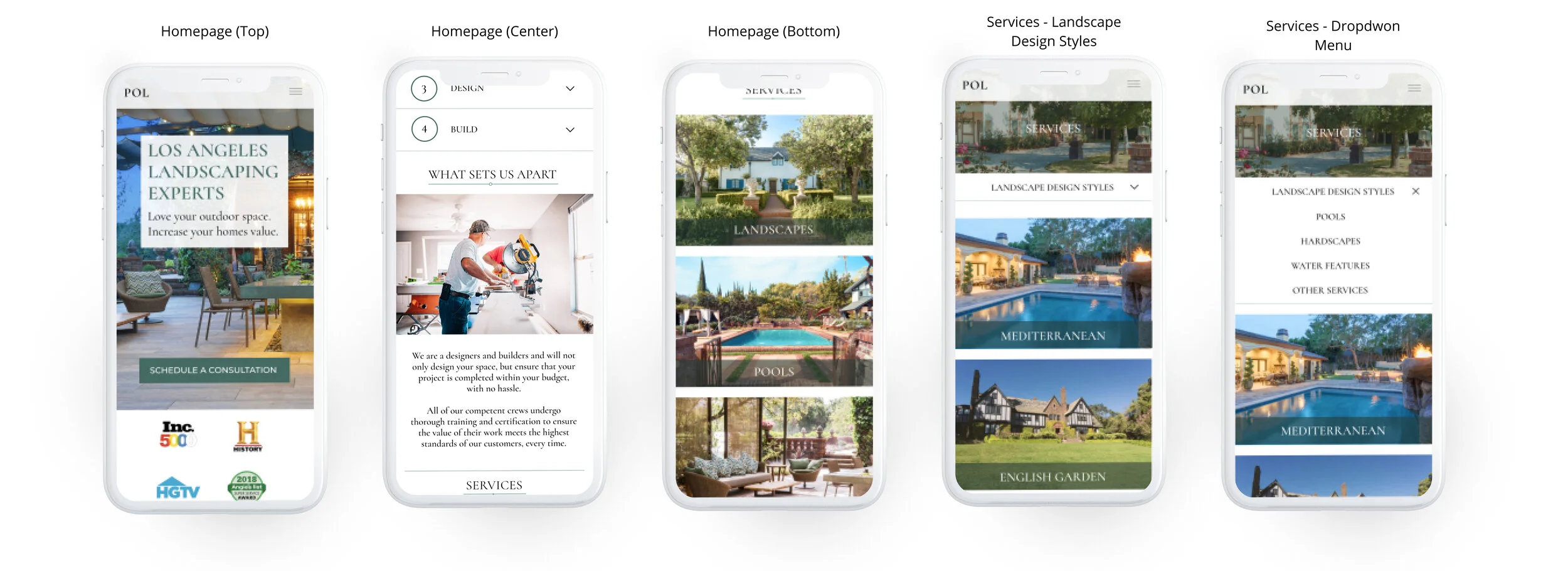
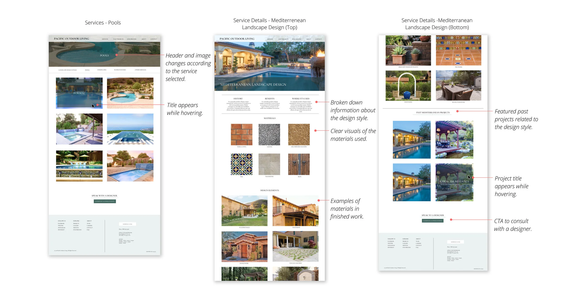
Using a secondary navigation menu, users can now browse through services within one page of the website as opposed to deciding which one to select from the original dropdown menu.
In addition to the Services page, I decided to create secondary menus in the About Us and Our Process pages as a way of breaking down information into a format that doesn’t overwhelm or pressure users with options.
The intention of this design was to allow people to browse in the same way they would looking at a catalog.
Mobile
Desktop
Results
My designs were successfully delivered to the development team. The user research I conducted allowed me to communicate the importance of the changes I wanted to make to the CEO. Within a couple of months of launching, these changes resulted in:
Positive feedback from users.
A 90% increase in pages per session.
A 100% increase in page views.
A 21% increase in session duration.
Client leads grew 58%.
The rate of users exiting the site was reduced by 22%.
View Full Case Study On Medium


